When we first received the pitch for Mountain, we were impressed. The Elevator Pitch hooked us right away!
“When someone you love dies, you must climb to Mountain’s summit to spread their ashes, or their spirit will forever be trapped in the material plane. Nobody understands this better than the unnamed traveler, but the chatty mouse-girl is an inexperienced climber, and Mountain is full of perils and pitfalls. When she meets the cool and confident (and, similarly, unnamed) Climber, she convinces them to help her reach the summit. But Climber has their own reasons to scale Mountain, and their strength alone won’t get the two of them to the top.”

Sheika: Reading through Mountain the first time, this is the line that really resonated with me.
“Mountain is perfect for readers who enjoy colorful, allegorical comics with simple stories and rich artwork...”
My first thought was - that’s me! I love those kinds of stories! It’s important to me that I connect with a story and creative team. I do my best work when I truly believe in the project. This also shows me that the creative team is able to view their work objectively and think about how it is similar and different from other works on the market. Easier said than done! I’m the kind of publisher that likes to have a working editorial relationship with the creative team - so I look for signs that the team is able to approach their work with a critical eye.
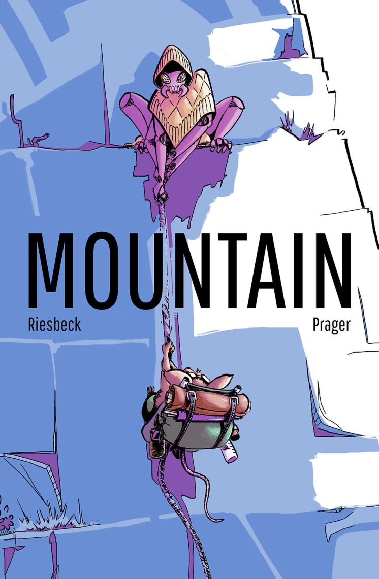
The cover image was really important as well. For a story centered around climbing a mountain, it was important that I could see the artist’s ability to execute their plan. The characters are dynamic and it’s obvious that Bitmap knew (or had researched) climbing techniques, hiking packs etc.

Jenna: What really struck me when looking at Mountain’s pitch was that I had a sense of the world right off the bat.
I basically looked at the pitch backwards, jumping straight down to the sample pages to see if I could get a sense of the story without context. Then I went back up to the concept art to see what were the themes the creative team was focused on and applying and then the synopsis.
The pages made a great impression on me; everything from the contemplative colors and the unapologetic non-human characters to the glimpses of this detailed, gorgeous world in the backgrounds. The atmosphere hit me immediately. That demonstrated that there was a lot of thought put into not just the story, but also the world in which the story took place.

Sheika: Yeah, the sample pages were so cool! Bitmap calls herself a “CMYK Matriarch” and she definitely deserves that title! The colors were vibrant yet still encapsulated the slow moodiness of the story. The Moebius-esque color palette really appealed to me and later became a source of inspiration for panelling as well.
This page also answered a question in the back of my mind - would the artist be able to pull off drawing both the zoomed out environments and the minute character moments that were central to the success of the story.

So what do we look for in a pitch?
Every publisher is different! Depending on the season, the books in their catalog, the projects coming down the pipeline, each person’s individual taste and interests . . . there’s no one perfect pitch. At the end of the day, a publisher is trying to figure out if your project is the right fit for them at this time, and if they are the right fit for YOU!
In our next post, we’ll talk more about what should go in a pitch packet!